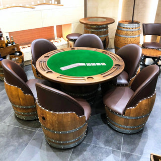
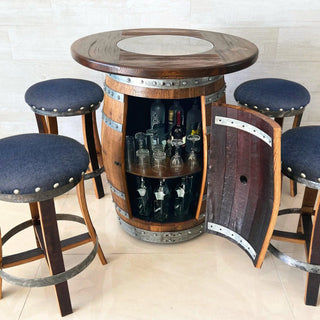
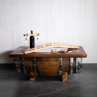
A color palette for reclaimed wood furniture should start with the wood itself - reclaimed Bordeaux oak from a wine barrel is a medium-to-dark warm-brown with red and amber undertones and visible wire-brushed grain - and then build a five- or six-color surround that supports the wood without competing with it. The seven palettes below are the ones our family workshop sees most often in finished client photography, paired with the specific paint references (Benjamin Moore and Farrow & Ball), fabric textures, and metal accents that make each combination work. For the full reclaimed oak product catalog these palettes are built around, see all products at obarrel.com.
Each palette below includes a wall color (the dominant 60% of visible color), a trim/secondary color (the 30%), an accent color (the 10%), a metal accent, and a textile texture recommendation. Combined, this five-element framework gives a designer enough to specify a room without overdesigning it. The 60-30-10 proportion rule is a standard ASID and Interior Design Society teaching convention rooted in the Bauhaus color-balance principles published by Johannes Itten in The Art of Color (1961). For broader designer specification context, see our designers specify authentic barrel furniture pillar guide, the P6 pillar hub.
1. Moody Emerald
Moody emerald is the highest-contrast palette for a reclaimed oak space. The deep green walls pull the red undertones in the oak forward, making the wood look richer than it does on a white wall. Best for: cigar lounges, bourbon rooms, and library bars where the room is intentionally low-light and intimate.
- Wall (60%): Farrow & Ball "Studio Green" No. 93 or Benjamin Moore "Forest Green" 2047-10
- Trim/secondary (30%): Bone-white trim (BM "White Dove" OC-17)
- Accent (10%): Antique brass hardware, brass-rimmed bar accessories
- Metal: Antique brass (dominant), blackened steel (secondary)
- Textile: Cognac leather, deep-green wool, raw linen
The wine barrel's reclaimed oak reads as nearly black against this wall when light is low, but as warm-amber when picture lights are on. The contrast is the point.
2. Cream and Rust
Cream-and-rust is the warmest palette and the safest specification for a multi-use lounge that needs to read as inviting in any light. The cream walls neutralize, the rust accents echo the amber tones in the reclaimed oak, and the overall room feels softer than emerald or charcoal palettes. Best for: family lounges, casual bars, sunroom-adjacent spaces.
- Wall (60%): BM "Swiss Coffee" OC-45 or "Linen White" 912
- Trim/secondary (30%): Warm-white trim (BM "Mascarpone" AF-20)
- Accent (10%): Burnt-orange or rust-red textiles
- Metal: Aged copper (dominant), antique brass (secondary)
- Textile: Rust-colored velvet, raw linen, natural jute rug
This palette photographs warmest. If the client wants the room to look like a magazine spread shot in afternoon light, this is the spec.
3. Charcoal and Brass
Charcoal-and-brass is the most contemporary of the seven palettes, sitting at the modern-industrial end of the spectrum without going cold. The charcoal walls give the reclaimed oak maximum tonal contrast (the wood reads as the warmest thing in the room), and the brass accents tie the palette together. Best for: urban lofts, downtown condos, modern basement bars.
- Wall (60%): BM "Wrought Iron" 2124-10 or Farrow & Ball "Off-Black" No. 57
- Trim/secondary (30%): Soft-white trim (BM "Decorator's White" CC-20)
- Accent (10%): Polished brass picture lights, brass-framed mirrors
- Metal: Brass (dominant), blackened steel hoops (secondary)
- Textile: Black-and-white herringbone, cognac leather, white wool
The risk: if the room has no natural light, charcoal walls feel oppressive. Confirm 2+ light sources and a dimmer-controlled overhead before specifying.
4. Navy and Camel
Navy-and-camel reads as classic-club, the palette of a Mayfair members' bar or an old-money library. The navy walls give the oak a slightly cooler undertone (the red drops back), and the camel textiles bridge the cool-warm tension. Best for: formal study bars, club-room aesthetics, traditional homes adding a barrel anchor.
- Wall (60%): BM "Hale Navy" HC-154 or Farrow & Ball "Hague Blue" No. 30
- Trim/secondary (30%): White trim (BM "Simply White" OC-117)
- Accent (10%): Camel-colored leather, brass-bound details
- Metal: Brass (dominant), polished nickel (secondary)
- Textile: Camel leather, navy wool, ivory linen
The reclaimed oak in a navy room looks slightly more "antique" than in a white room - the cool wall pulls historical undertones forward.
5. Warm White and Black Steel
Warm-white-and-black-steel is the minimum-intervention palette - the wall stays neutral, and the design work happens in the textures and the metal accent. Best for: rented apartments where wall color cannot change, open-plan kitchens with a barrel bar anchor, and clients who want the reclaimed oak to be the unambiguous star of the room.
- Wall (60%): BM "Swiss Coffee" OC-45 or "White Dove" OC-17
- Trim/secondary (30%): Same warm white throughout (no contrast trim)
- Accent (10%): Black steel pendant lights, black steel bar stool frames
- Metal: Blackened steel (dominant), no secondary
- Textile: Natural linen, black leather, ivory wool
This is the palette that lets the wood tell the story. The reclaimed oak is the loudest thing in the room.
6. Sage and Terracotta
Sage-and-terracotta is the most contemporary California-influenced palette. The sage green walls are softer than emerald, the terracotta accents echo the wine-region origin of the oak, and the overall feel is wine-country-residential rather than basement-bar. Best for: ground-floor bar setups in modern homes, sunroom-adjacent lounges, and clients who want a "wine-country" reference without going full Provence.
- Wall (60%): BM "Saybrook Sage" HC-114 or Farrow & Ball "Card Room Green" No. 79
- Trim/secondary (30%): Cream trim (BM "Linen White" 912)
- Accent (10%): Terracotta tile, terracotta-colored textiles
- Metal: Aged brass (dominant), no secondary
- Textile: Terracotta velvet, raw linen, jute rug
Works especially well if a piece of reclaimed-wood shelving sits next to a terracotta-tile backsplash. The materials echo.
7. Plum and Gold
Plum-and-gold is the most dramatic of the seven palettes and the one that asks the most of the room. Deep plum walls require strong lighting and confident textiles to avoid feeling heavy. When it works, the reclaimed oak reads as honey-colored against the plum, and the room photographs like a hotel bar. Best for: statement-piece rooms, formal bars, and high-design clients.
- Wall (60%): BM "Shadow" 2117-30 or Farrow & Ball "Brinjal" No. 222
- Trim/secondary (30%): Soft-white trim (BM "Chantilly Lace" OC-65)
- Accent (10%): Polished gold (not brass) hardware, gold-framed art
- Metal: Polished gold (dominant), blackened steel (secondary)
- Textile: Velvet (any deep jewel tone), silk, polished cotton
This is the palette to specify for top-tier clients investing $1,500+ in a single statement barrel piece who want the bar to be the unmistakable focal point of a $250K+ renovation. Roughly the top 5% of orders across our 1,527+ Etsy sales sit in this configuration tier.
Summary Table
| Palette | Wall | Metal | Best For |
|---|---|---|---|
| Moody Emerald | Forest Green | Antique brass | Cigar lounge |
| Cream and Rust | Swiss Coffee | Aged copper | Family lounge |
| Charcoal and Brass | Wrought Iron | Brass | Urban loft |
| Navy and Camel | Hale Navy | Brass | Traditional club |
| Warm White / Black Steel | Swiss Coffee | Black steel | Minimum intervention |
| Sage and Terracotta | Saybrook Sage | Aged brass | Wine-country residential |
| Plum and Gold | Shadow | Polished gold | Statement bar |
How to Choose Between Palettes
Two filters narrow the seven options:
-
Light availability: rooms with abundant natural light handle the dark palettes (emerald, charcoal, navy, plum). Rooms with limited natural light should stick to cream-and-rust, warm-white, or sage-and-terracotta.
-
Room function: high-intimacy rooms (cigar lounge, library bar) reward dark palettes. High-flow rooms (open-plan lounges, multi-use family spaces) reward lighter palettes.
A reasonable specification process is to pre-select three palettes that pass both filters, then present all three to the client with mood-board mockups. Most clients choose between two of the three; the third is the fallback.
How the Reclaimed Oak Holds Up Against Each Palette
A note worth knowing: the reclaimed oak in our pieces is wire-brushed Bordeaux oak that has aged wine for 5+ years before becoming furniture. The grain has texture and color variation across staves on a single barrel. This means the wood does not read as a single uniform brown - it reads as a range from warm-amber to deep-chocolate. The palettes above all account for this variation. A single-tone wood (like a new oak slab or a stained pine) would behave differently against the same wall colors.
If the client has seen reclaimed oak pieces only in a showroom under retail lighting, send them photos of finished installations under warm residential lighting before locking the palette. The wood looks meaningfully different in the two contexts. The Illuminating Engineering Society (IES) maintains the Color Rendering Index (CRI) standard cited in most lighting specifications; CRI 90+ at 2700K is the standard residential warm spec, while typical retail showrooms run CRI 80-85 at 3500-4000K, which is the source of most "the wood looked different in person" reports.
For the full reclaimed oak product catalog, see all products at obarrel.com. For the companion mood-board build process, see post #84 on rustic-industrial bar mood boards. For the broader designer-and-trade specification hub, see our designers specify authentic barrel furniture pillar guide.